 This post was originally written by Katharina Cavano, the content strategist at Contactually. You can read that post here. Contactually is a virtual assistant for your email that discovers opportunities in your inbox by proactively suggesting next steps to take with your most important contacts.
When was the last time you made an ask of your contacts within an email? Whether you wanted them to sign up for your latest webinar or check out a blog post you were featured in, you probably created some sort of call-to-action, or CTA. How effective was your CTA? How many of your contacts actually followed through on the action you asked of them? If the number is low, it may be time for you to reassess how you create your CTAs and even what they look like.
Better yet, think about the last time you got a promotional email in your inbox. It had a compelling enough subject line to get you to open it, and once you opened it, did you click through to shop or open their website or sign up? Or did you open and close it back out in quick succession?
That compelling CTA – or not so compelling one – is a great starting point for creating your own call to actions in your emails. Keep in mind the three factors that go into creating a successful CTA: color, message and placement in your email.
Creating a more effective call-to-action
Before you start your CTA creation, think about what you want your contact to do. It’s a call to action, and you want your contact to take immediate action, so what’s going to get them to do that? Because, we’ll bet that the basic ‘click here’ won’t entice too many folks in to actually clicking there. You need to give them a reason to click, so what will they get out of it if they do go ahead and click?
Perfecting your message
Your CTA should provide your contacts with direction and be clear on what you want them to do or what they’ll get out of it when they do click.
Three factors to keep in mind while writing your CTA message: does it convey value, meaning what will your contact gain by clicking on the button? If you want them to subscribe to your newsletter, you could just use the verb subscribe, but you could also convey the value they’ll get out of your newsletter with words like ‘learn’ or ‘discover.’
There’s always the enticing factor of creating some sort of urgency behind the action because you likely want to get your contacts to act now. This is especially useful for sales or last minute webinar sign-ups. Create the urgency with timing or the fact that there’s not many spots left, and leave your contacts wanting to grab what you’re offering before it’s too late.
Take a look through your own inbox, was there a particular email that grabbed you and made you feel the urgency of making a purchase or checking out a sale right away? Test out that language or try to invoke that emotion you had within your own contacts.
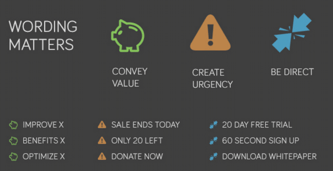
When all else fails, be direct. Ask yourself, what’s the catch here? There’s no room for you to be unclear, and you don’t want to give your contact a moment of doubt as they take a look at your button. It’s too easy for them to close out of the email and keep scrolling through their inbox, leaving you and your CTA in the dust. If you’re looking to book up your next webinar, then your direct message should be along the lines of ‘reserve your seat today.’
Your contacts will know exactly what they’re getting when they click on that button and won’t face that moment of confusion or doubt that could lead them away from your email.
If you’re inviting your leads to your latest open house, doesn’t the CTA “Find Your New Home Tomorrow” sound better than “Sign Up For This Open House?” Be colorful and if possible, invoke some real emotions with your words here.
Using the right color
There’s a lot of debate around the subject of the best color used for a call-to-action button and plenty of studies done around it as well. While there’s not one definitive answer on the best color for a CTA, there’s some color psychology that we can use to assess whether your button choice will express the purpose of your action.
A lot of the psychology around color can be fairly subjective or personal, but across the board, there are particular emotions evoked by these basic colors of the rainbow that can be used for getting your contacts to take notice and action.
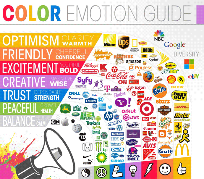
Certain well-known brands often exude a particular emotion simply based on their choice of color for logos and branding. And while it may be an assumption that ‘green for go’ would be the perfect choice for a call-to-action button, green has been found to be more associated with feelings like ‘peace’ and ‘health’ rather than something more action-oriented.
Instead, it’s blue and orange that often win out in the color ‘wars’ of CTA and isn’t that interesting considering that within most websites and emails that a hyperlink out to another page is automatically in a blue font?
If you’re able to include a button in your email and go above and beyond the hyperlink that may appear hidden within the text of the email, then by all means, do it. Keep it simple but make it stand out. A pop of color is one of the best ways to get your contacts’ attention right within the email.
Depending on your button color, use either black or white text for the message – don’t use two bright conflicting colors for both the button and the text. When you’re picking your CTA color, keep in mind the emotion or action you want your contacts to feel or do and ensure that it won’t get lost on the page. You want it to be clear where they should click, and leave them with no questions.
Asking at just the right point
Where do you put your button or link within the body of your email? If you’re making an ask of your contacts, generally you should be pretty upfront about it and place it near the beginning of the email, lest your contact lose interest and not make it till the end of the email. But CTAs can be tricky, if you want your network to sign up for a webinar, you wouldn’t put that CTA first thing without any explanation, right? While you want to draw their attention to the call-to-action, you also want to build up to it as they work their way down the page or down the body of the email.
When you’re placing a CTA on a landing page or website, you have a lot of options for where exactly you’ll put it, in an email you don’t have as much room or real estate to play with. Because of this, you have few choices and a small time frame to get the clicks within. As of 2015, the average human has an attention span of about 8 seconds.
Potentially, if you’re writing a long email with your CTA down at the bottom, your contacts may not make it down that far with that short of an attention span. To break it down even further, the average ‘high-level exec’ reads about 575 words per minute, which breaks down to about 9 words per second. That leaves you with 72 words for someone with that 8-second attention span, before you may lose your email recipient’s attention altogether.
This is a great illustration of how it’s better to get to your point in a succinct fashion and make it clear what you’re asking from the email. Your CTA should be towards the top, but not the first thing your contacts see they’ll need a little context in order for you to get them to click after all!
You’ll be action-oriented in no time
What’s the takeaway here? Overall, keep it simple and actionable. The last thing you want is to overwhelm or confuse your contacts within the email and leave them with that moment of doubt where they can choose to close out the email and take no action at all. Use strong action-oriented words, and enticing colors to draw them in and get that click.
There’s no shame in getting inspiration from all those promotional emails sitting in your inbox right now. Scroll through those emails and see what catches your eye, even better…what gets you to click on it. Is it the ‘Shop Now’ button placed midway through the email? Or maybe it was the ‘Watch the Video’ button that enticed you after you read the subject line. Luckily, most of us send a lot of emails, which leaves a lot of room for testing.
Try out the new button color or placement on the page. Does the 72 word trick work or do you find that a CTA on the bottom of the page works best? There’s always room for testing and further improvement when it comes to your calls-to-action, because once you find what works, you may be hard pressed to change it up anytime soon.
For more on effective CTA’s within employee email signatures, check out our latest resource below: