The Dalai Lama once said: Our prime purpose in this life is to help others. And if you cant help them, at least dont hurt them with bad email signatures.
Just kidding, he never said that. But if he had, he wouldnt have been wrong.
Email signatures, like those who create them, come in many shapes and sizes. Some are sharp and professional bordering on brusque. Others are quirky, bringing in fuchsia-colored fonts and motivational prosaicisms. And still too many are overdone, an explosion of links, websites, social profiles, images and, callously, fax numbers. These bad email signatures hurt more than the eyes of your recipients. They can have some seriously negative impact on your brand, too.
More than 205 billion emails were sent and received per day in 2015, according to a study by The Radicati Group. That number is only expected to grow with experts predicting itll reach more than 246 billion in the next two years. And the average worker receives more than 50 emails each day, while a quarter of us have more than 100 hit our inbox in a day, according to a 2012 study by Varonis Systems.
Many first impressions are made via email. And your email signature is your chance to shape that impression. A professional email signature is both visually appealing while it conveys your skills, experiences and contact details, while bad email signatures leave your recipients wondering whats wrong with you.
Like any form of art (and yes, crafting email signatures is an art form) theres a level of subjectivity involved. Theres also a bit of technical skill. Fortunately, when it comes to style and implementation, theres a fairly short list of whats acceptable and no need to push the envelope too far to present a refined and professional email signature.
Heres a list of the 15 worst blunders that make bad email signatures:
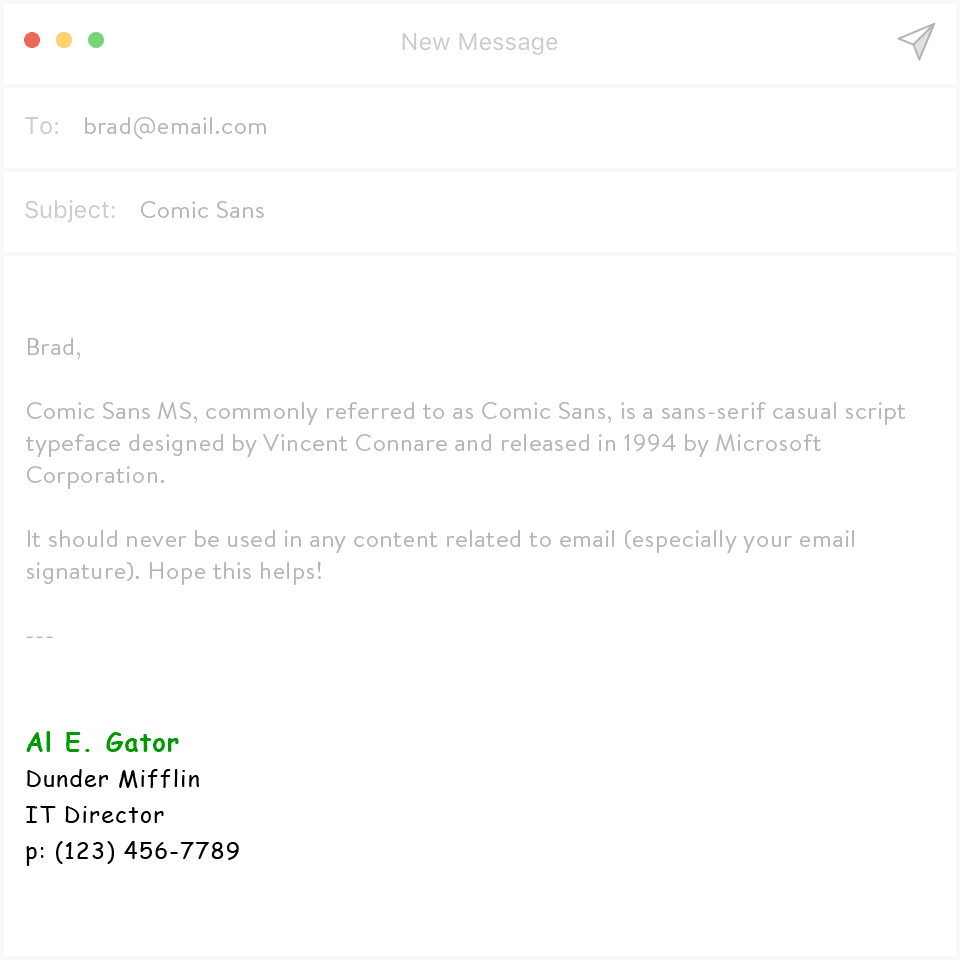
1. Comic Sans
Comic Sans was originally made for the little comic book-style help speech bubbles in Microsoft programs designed primarily for youngsters. Using it in your email signatures could damage your credibility as a serious professional.
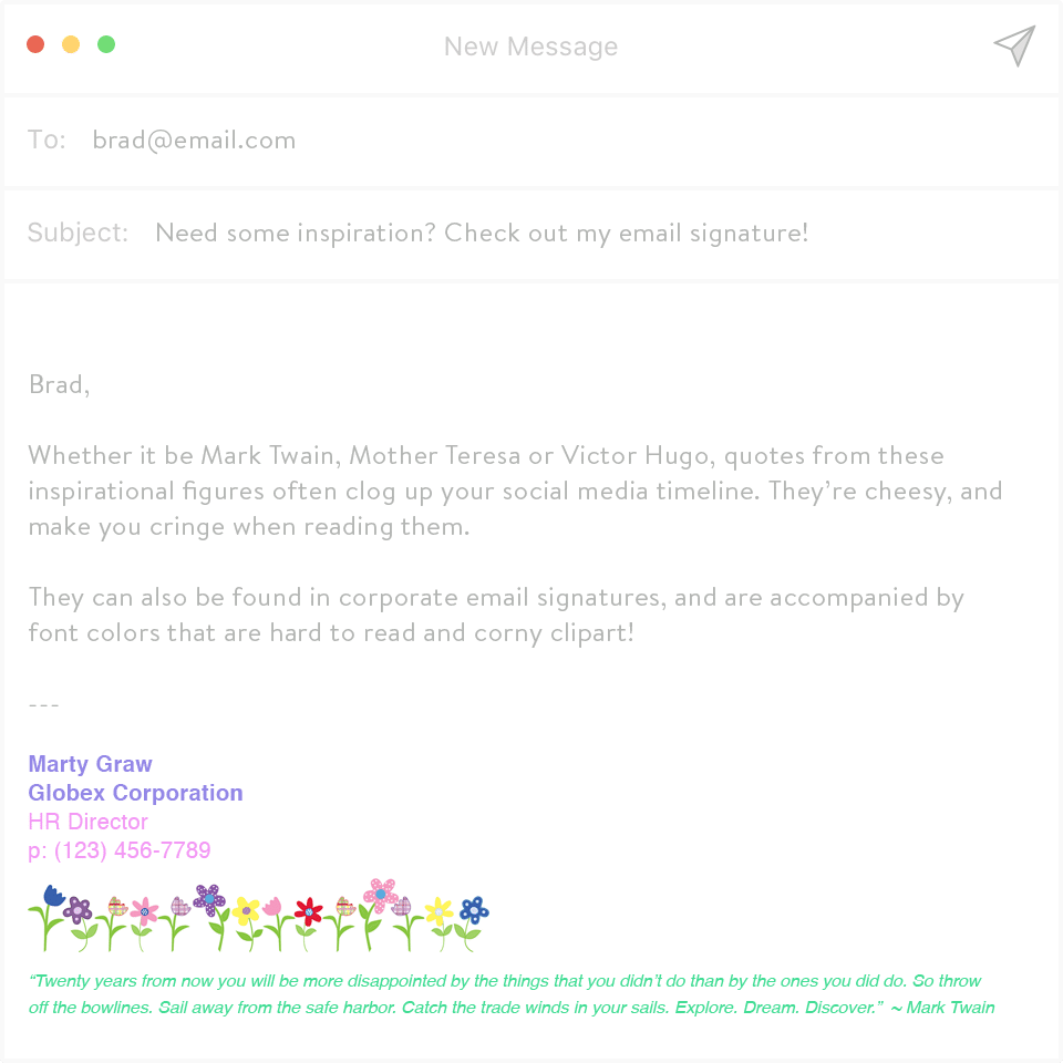
2. Inspirational Quotes
Inspirational quotes belong on Pinterest and Tumbler, not in your email signature.
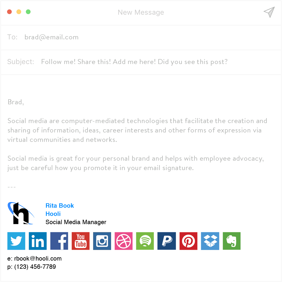
3. +10 Social Media Icons
People arent going to click every single media icon you have. So if this is you:
Stop. The more options you offer, the less likely any of them will be clicked – it’s a phenomenon called the Paradox of Choice. Instead, try focusing on the few accounts that matter the most to growing your business or building your personal brand. And limit your signature to include no more than three.
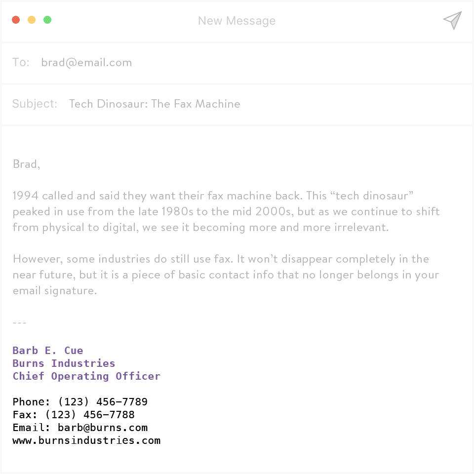
4. Fax Numbers
Most people dont fax anymore. The technology is dated and has been widely removed from the office. Instead, people can simply scan a document and pop it into their reply.
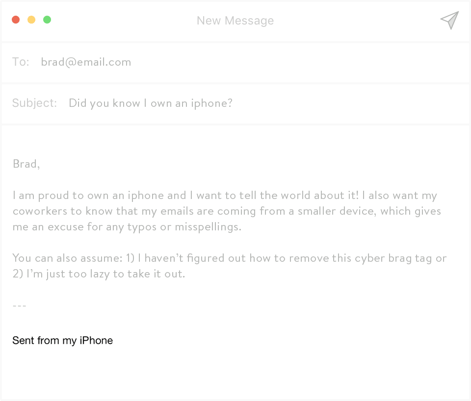
5. Sent from my iPhone
Please read as: So sorry for not proofreading. Im completely capable of grammar and spell check, but Im on my iPhone, so that means rules dont apply to me.
Oh and if I call you jerk instead of Jack, yeah, thats totally autocorrect. Totally.
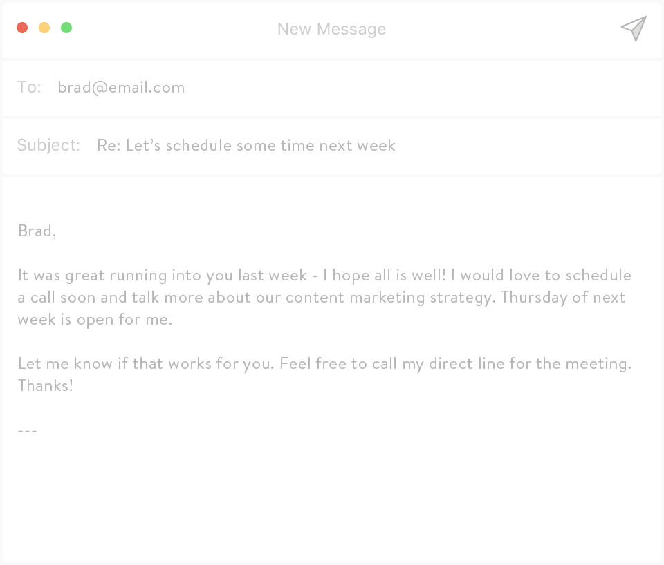
6. Blank Signature
The only thing worse than including everything in your email signature is including nothing. You want to be professional and helpful in your email, so include the relevant information like your name, your phone number and a call-to-action. Oh, and if you work with international clients, dont forget the prefix for your countrys code on your phone number!
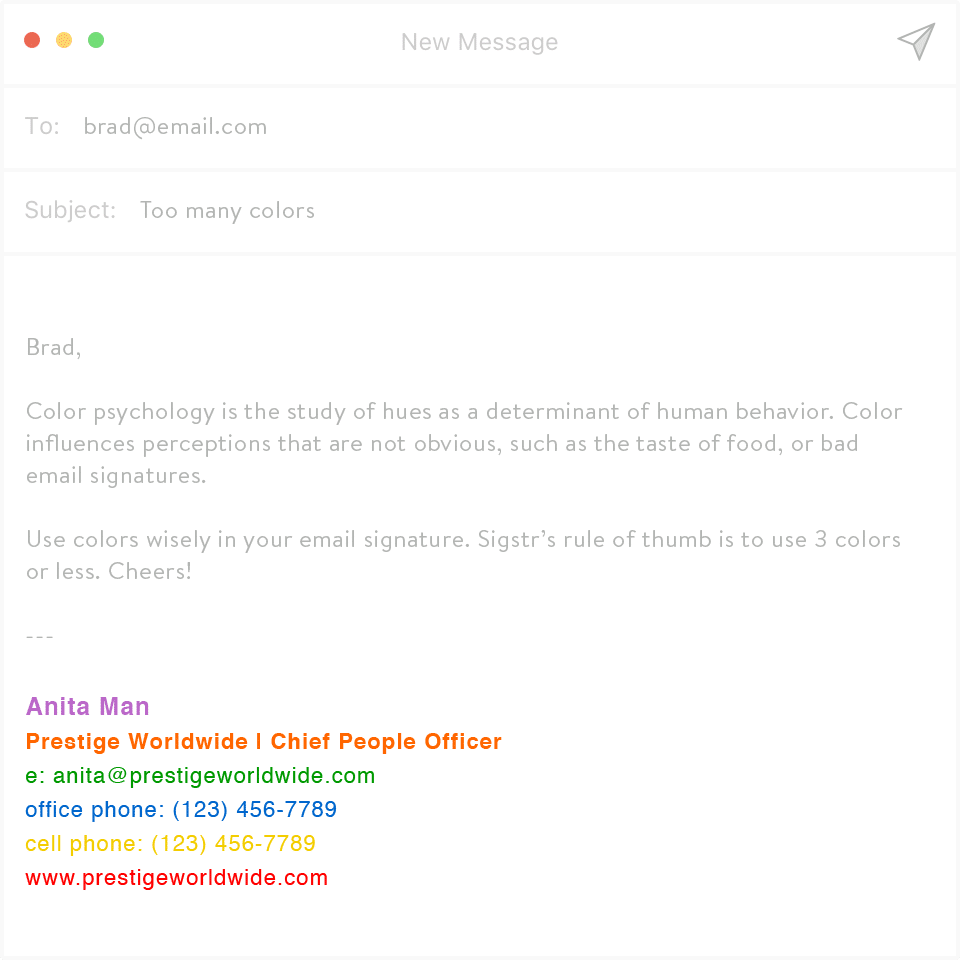
7. Too Many Font Colors
Okay this ones a little more subjective. But the issue with adding in an abundance of color is that there are many more opportunities to get it wrong using clashing colors, visual imbalance, over-complication and crowding your information. If youre in a more creative field, feel free to use a few colors to add style and personality to your professional sign-off, but use the general rules of design.
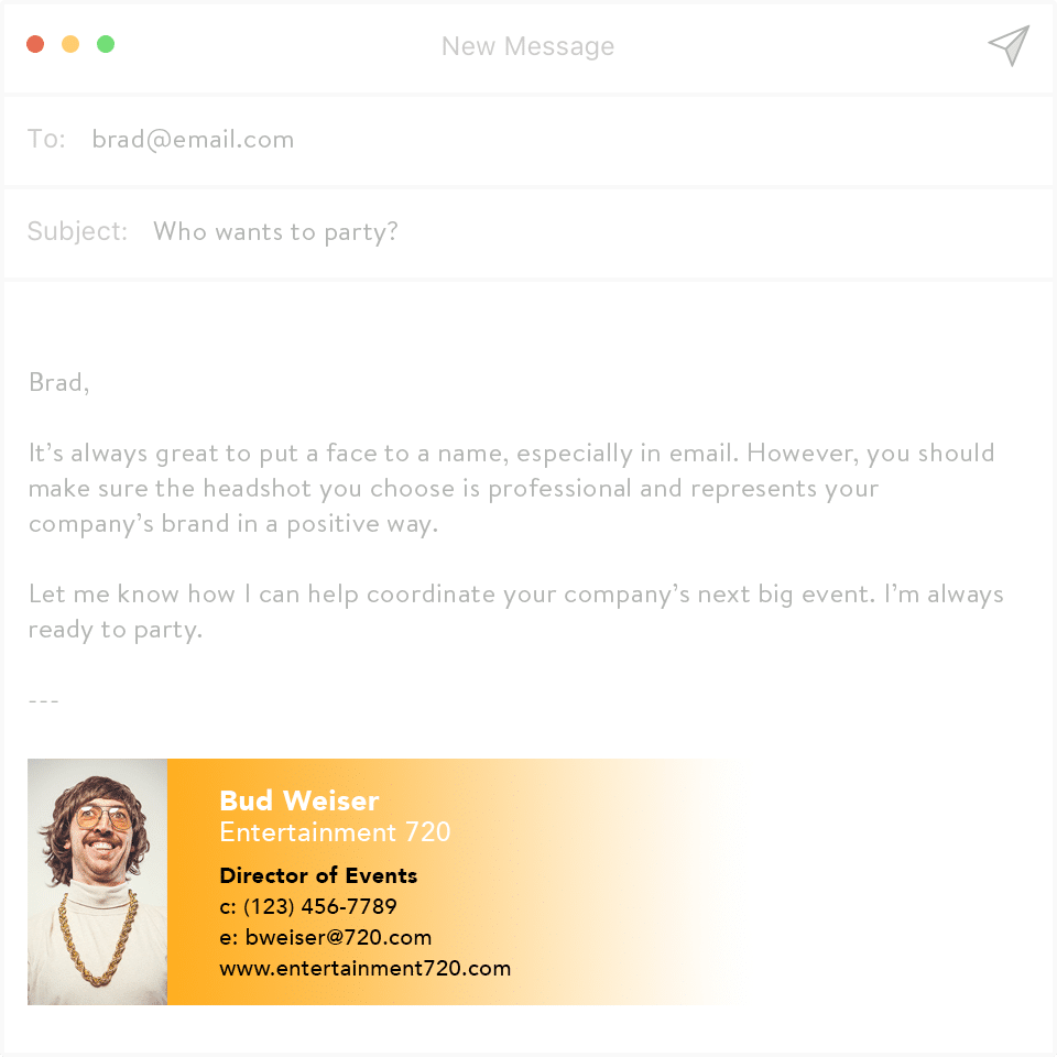
8. Awkward Avatar Photos
People tend to remember visuals better than text. And according to a study from MIT neuroscientists, images that contain people are the most memorable. So leave a good impression with a quality avatar photo one that shows your strengths, not your lazy eye.
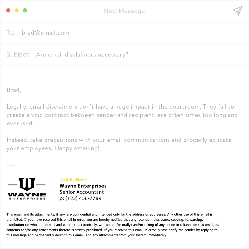
9. Lengthy Disclaimers
Disclaimers like, This email was intended for the recipients only, or Our company accepts no liability for this emails content, arent just annoying they probably hold no legal weight either. Not to mention, theyre usually at the end of an email – after you’ve already read what you “weren’t supposed to read.” And often they take up way too much room in your companys bad email signatures.
If you really must have a non-disclosure or legal disclaimer, its better to send that information via secure channels in an encrypted format.
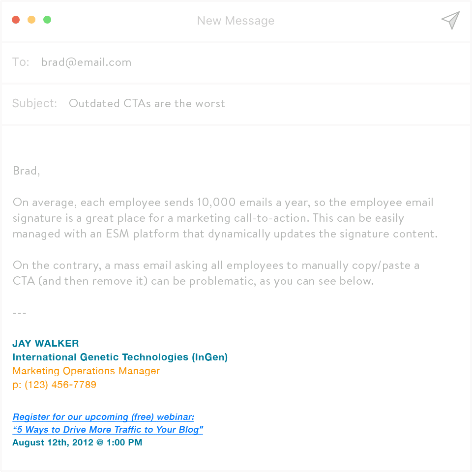
10. Outdated CTA
Make your contacts happier, have better support, create meaningful conversations whatever it is youre trying to do in your company, theres a piece of content that can help you do it better. So, including a CTA to the content is highly recommended (we can help). But make sure your content is relevant and current. Sending someone to a page that hasnt been updated in months could send the message youre not serious
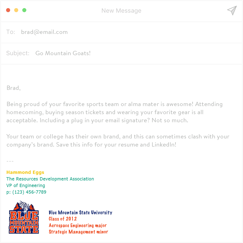
11. Alma Mater
Oh wow! Youre a Mountain Goat class of 12? By adding your alma mater and graduation year, youre essentially telling your contacts that youre just not to be taken seriously. Keep this information to your LinkedIn profile, not your bad email signatures.
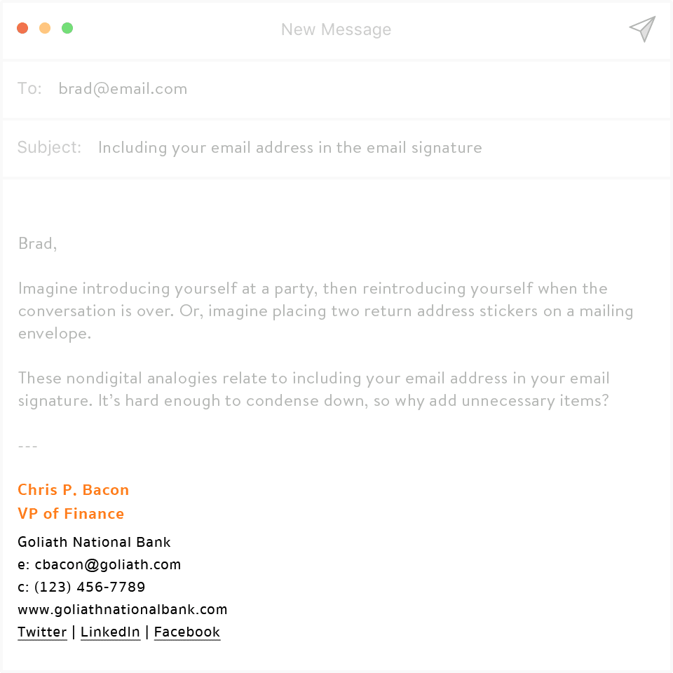
12. Including Your Email Address
Imagine introducing yourself at a party, then reintroducing yourself when the conversation is over. Awkward, right?
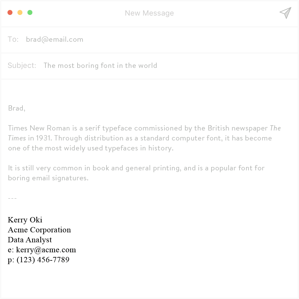
13. Times New Roman
The seemingly innocuous (and often default) Times New Roman is a serious and formal font. Its also insanely boring. Using it in your email signature is like emailing and saying that you didnt put any thought into what you just sent its like wearing sweatpants to the office. (Unless youre in a home office, alone, in which case, I fully support sweatpants. Still have qualms with Times New Roman, though.)
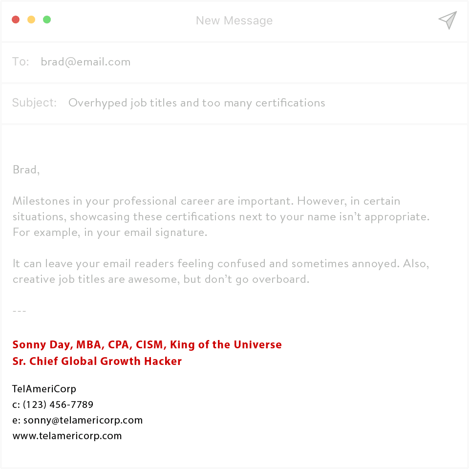
14. Too Many Titles
Too many titles, or even titles youve just simply made up are maddening. Adding in every professional title looks cluttered and can come across a bit arrogant if its irrelevant to your current position.
Do you have a specialized degree or certification thats relevant to your current position? Feel free to add it in just dont go overboard.
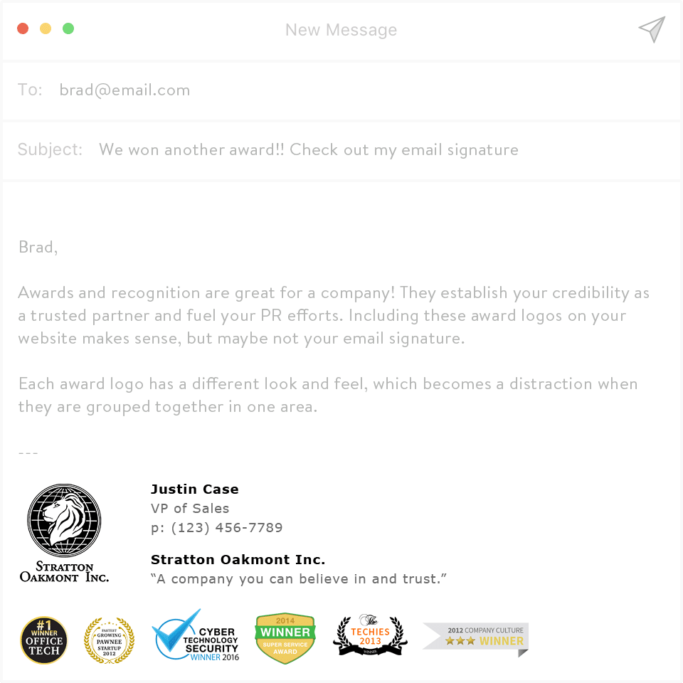
15. Excessive Awards
The information in your email signature should be relevant to your title, company, skills and contact details youre not sending out your resume via your bad email signatures. Excess text and logos are distracting and unnecessary.
