Its tempting – after youve invested hours upon hours into crafting the perfect email marketing message – to imagine your subscribers hanging on every word youve written.
Surely, you think, they read closely, picking up on every nuance and every clever twist of language youve employed.
Of course, your own email consumption behaviors likely disprove this theory right off the bat. If you even open a message – and thats a big if – data suggests that youre much more likely to skim its contents than to give it a close read. Heres what the numbers say:
- More than 20% of marketing emails never make it to a subscribers inbox.
- Of the nearly 200 billion emails sent every day worldwide, 84% are considered spam. A full 55% of all email users admit that they dont open and read messages regularly – whether business or personal.
- According to a recent GetResponse study, 41% of all emails are now opened on a mobile device, and 42% of users delete emails that dont display correctly on their mobile phones.
- Only 11% of email campaigns use responsive design to optimize their email layout.
So what, in light of these trends, should marketers do? Interestingly, we may find answers and suggested recourse by understanding the way people consume content on the web at large.
How We Read on the Web
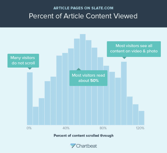
Back in 2013, Slate grabbed headlines with a piece titled, You Wont Finish This Article.
In it, Slate contributor Farhad Manjoo and Chartbeat analyzed the way the digital magazines readers engaged with its content, finding that 38% of visitors bounced immediately, while a smaller number never once scrolled below the fold. Of those that stayed, only 50% scrolled more than a few hundred words into the text.
Over time, marketers have developed engagement strategies designed to encourage people to remain on-site longer.
The Usability Geek website, for example, offers the following suggestions for improving the readability of your content:
- “Readers are very likely to skim, so you want them to find what they need quickly. Use bullet points, numbered lists, or bold headlines for this purpose.
- “Fonts like Arial and Times New Roman (especially for headings) are staples because they are easy to read.
- “You will want complementary font and background color, with the font being many shades darker. Also, try to remember which colors clash and the psychological effects that different colors have on readers.
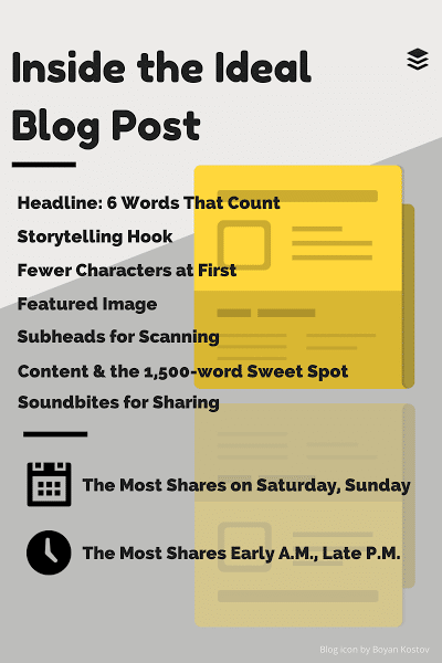
Further, the team at Buffer has compiled a list of the six most important elements that make a blog post successful:
If these suggestions seem familiar, its likely because so many websites adopt these standards. Email marketing messages, on the other hand, havent universally caught up.
What This Means for Your Email
Implementing the best practices above helps improve engagement with your email marketing messages, as well as your blog posts.
Think about the way you consume blog and email content. We skim not because were lazy, but because we arent sure whether or not the content were currently consuming will be helpful. Understanding this inherent challenge enables marketers to craft content that resolves this conflict as quickly as possible.
Here’s how to put the data and insights to work for your email marketing campaigns:
Your Subject Line
Your subject line is important in terms of your messages engagement. So, you wont be surprised to hear that 64% of subscribers say they are likely to read your email because of who its from. 47% of email recipients open an email based on the subject line.
There are different schools of thought when it comes to who the specific sender of your messages should be. Some marketers suggest attributing messages to the name of a specific person within your company. Others argue that placing your companys name in the From field gives it an air of greater authenticity.
Ultimately, youll need to test different options to see which one drives the best results.
The question of subject line content can be answered a bit more definitively, according to the following data points:
- A report by Retention Science found that subject lines with 6 to 10 words deliver the highest open rate, making 8 words an ideal number for a subject line.
- According to research by Adestra, subject lines 70 characters and up tested to be most beneficial to engage readers in clicking through to the content.
- Those fewer than 10 characters long had an open rate of 58%, while there appears to be really only one area to avoid: the subject line of 60 to 70 characters.
Take, for example, the brief three-character subject line from one of President Barack Obamas fundraising messages:
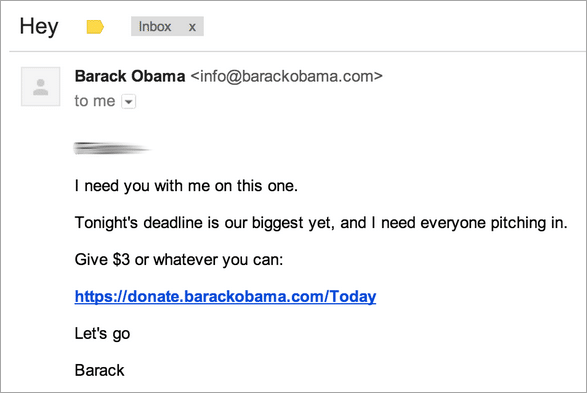
It’s quick. Its to-the-point. And its effective.
Putting this all together, Copyhackers Joanna Wiebe offers a series of concrete suggestions for making email subject lines as engaging as possible:
- Lead with an action word
- Include your brand name
- Avoid spam-trigger words, exclamation points and odd punctuation
- Avoid being cutesy or clever
Again, testing is your friend. The suggestions above can be considered starting point guidelines. However, theres no real replacement for data based on your own audiences behaviors and activities.
Your Images
The days where email messages were composed entirely of text are long gone. Now, images and even embedded video files are being used more frequently, as theyre useful from both an engagement and information retention perspective.
Data shared by John Medina of Brain Rules suggests that, When people hear information, they’re likely to remember only 10% of that information three days later. However, if a relevant image is paired with that same information, people retained 65% of the information three days later.
In addition, images can engage people long enough to decide whether or not your message is worth a closer look.
In an article written for the QuickSprout blog, marketer Neil Patel shares data generated by PRWebs Director of Product Management. Thousands of press releases were examined to see whether or not including an image affected average time on page. What he found was that readers stuck around nearly 30 seconds longer when the press release incorporated at least one multimedia asset.
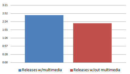
Yes, the data above pertains to web content, but its impact likely extends to email messages as well. Choose good images (read: not clip art or stock imagery) and you may see the same impact of greater attention.
Your First Sentence
According to Aaron Orendorff, writing for Fast Company:
Your first line of text, following your recipients name, is often as far as the reader gets. If the message is short, not packed with nonessential junk, youre more likely to get that reader to venture further.
So what should your first line look like? Customer.ios Colin Nederkoorn sums it up succinctly: The job of every line in your email is to make people want to read the next line.
The way you do this will be different in different types of messages. For example, you might get people to stick around by asking a probing question subscribers will want to hear the answer to. In other cases, your first sentence might promise a discount, coupon code or free product, while requiring subscribers to read of for more details on how to claim it.
The only thing your first sentence shouldnt do is bore readers. Review every message on this basis and do your best to punch up any opening lines that seem lacking.
Your Bullets
In an article on Wired, Paolo Gaudiano shared research from speed-reading company, Spritz:
The folks at Spritz realized that, when we read, only about 20% of the time is spent processing content, while the remaining 80% is spent moving your eyes around to scan the text.
Scanning behavior, it seems, is as common to email marketing as it is web reading. Heres an example of AdAge.coms Daily News email message, with a heat map to indicate where visitors attention was drawn:
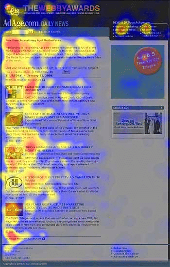
Campaign Monitor explains whats happening here:
the average time allocated to a newsletter after opening it was only 51 seconds. ‘Reading’ is not even the right word, since participants fully read only 19% of newsletters. The predominant user behavior was scanning. Often, users didnt even scan the entire newsletter: 35% of the time, participants only skimmed a small part of the newsletter or glanced at the content.
Bullets – along with other scanning, readability features – are your friend. Whether that be in your blog content, your email messages or both. Include them to help your subscribers get the most out of your email content.
Your P.S.
Finally, theres the question of the post-script. It once reigned in popularity, but many marketers question whether its still relevant. Or, if past abuse has rendered it ineffective.
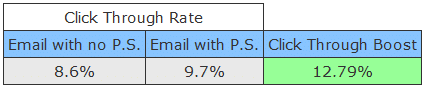
Marketer Richard Hayes may have the answer, based on a past experiment he carried out:
I ran an email split test where 1,500 recipients received an email without a postscript note and another 1,500 received the exact same email but with a P.S. note in the footer of the email reminding them of the offer, which read:
At the end of the experiment, Hayes experienced a nearly 13% click-through boost that could be attributed to his use of the P.S.
Split testing your messages will determine whether or not these guidelines apply to your audience. Times change, readers needs differ – and you wont know what the right combination of elements and copy is for your audience without your own data.
Use these principles as a starting point only as you look for the most effective format for your own email marketing messages.
Do you have another data point to add to this compilation? Do your own experiences disprove these recommendations? Tweet @sujanpatel and @SigstrApp and let us know your thoughts.